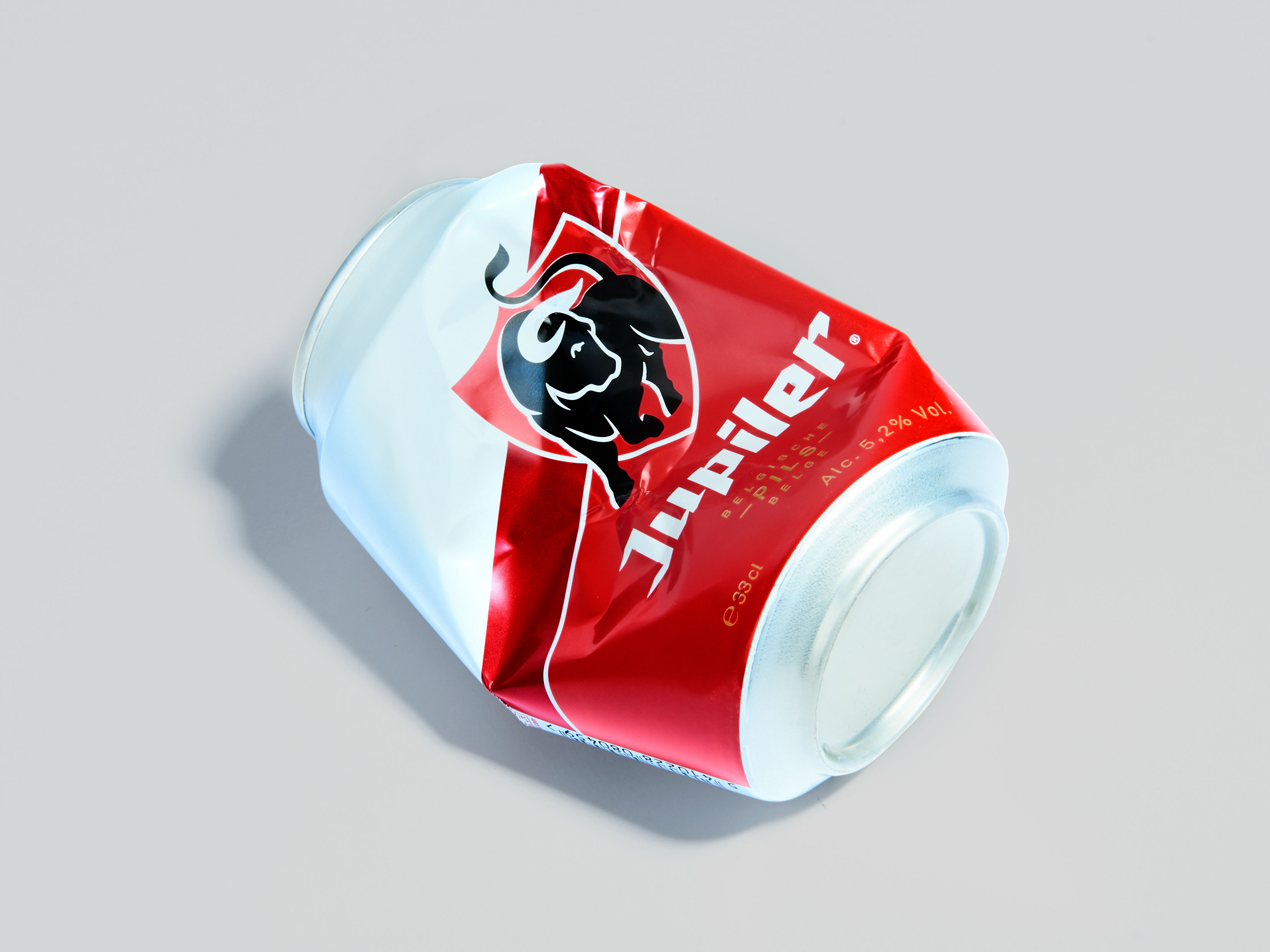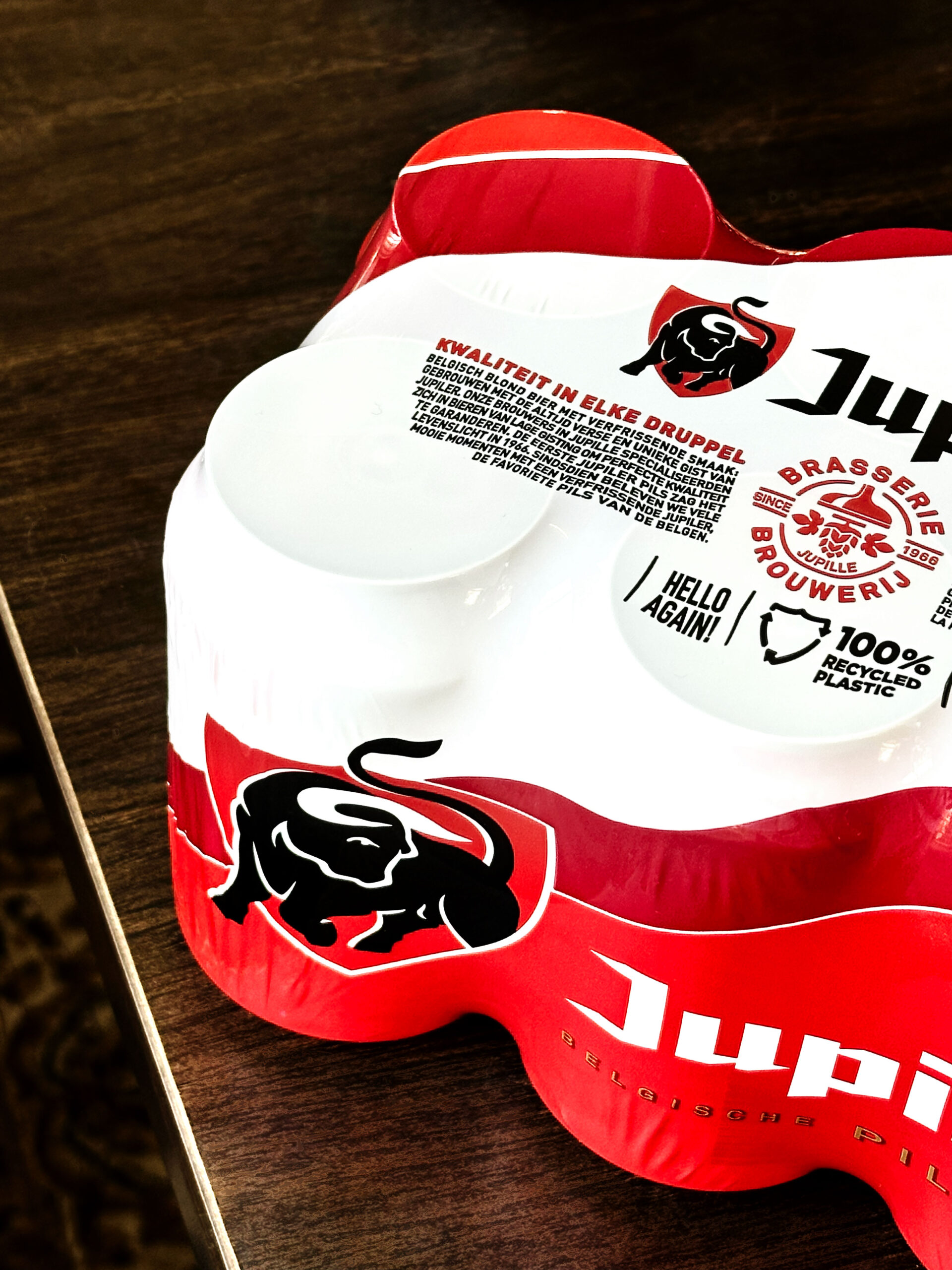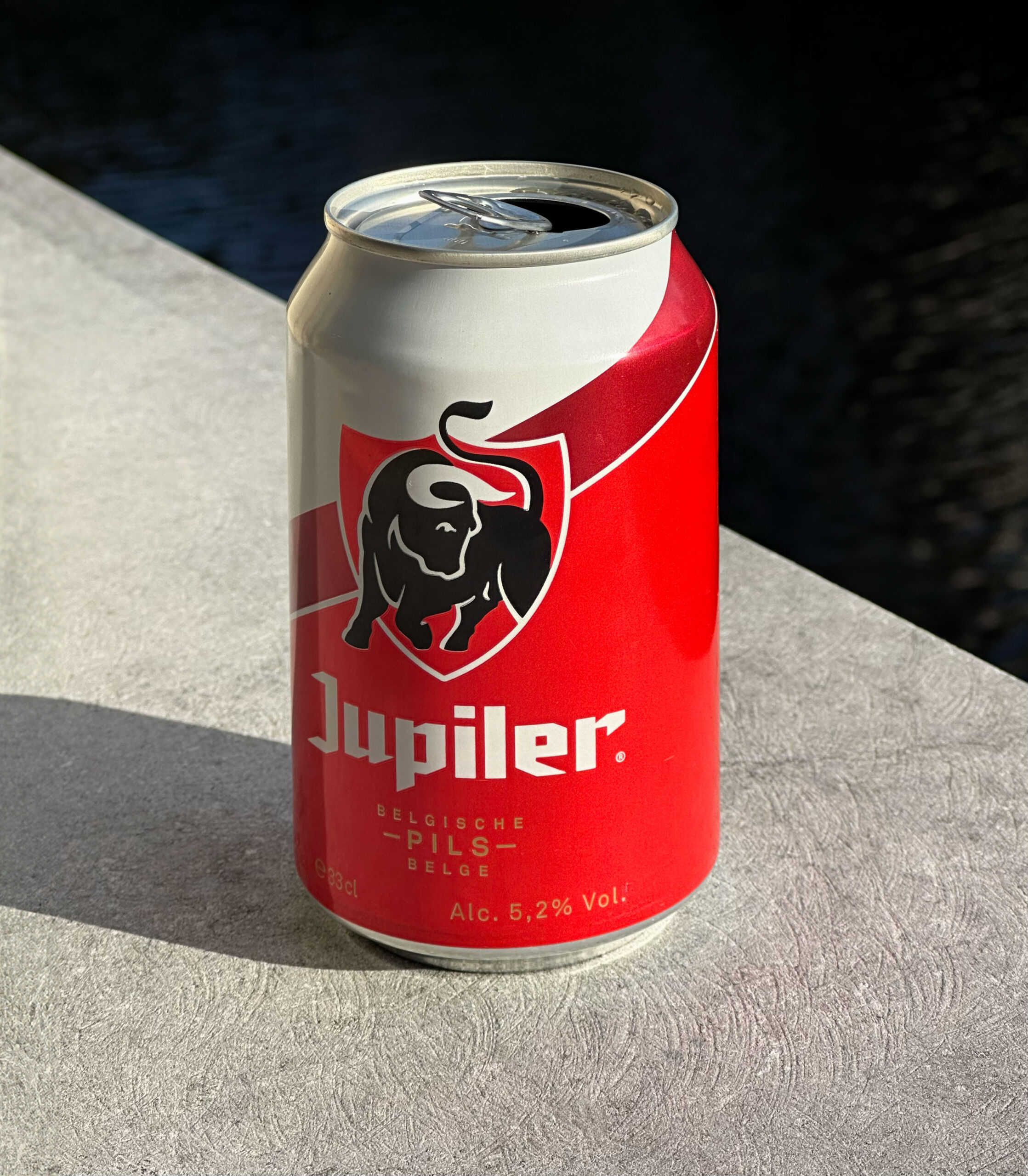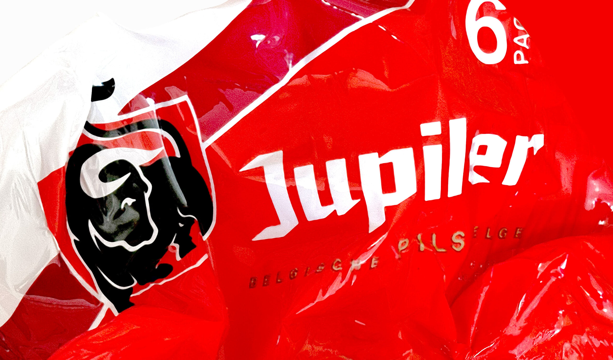
A packaging rework for Belgium’s favourite beer. This iconic staple of the Benelux region, known locally for its accesible affordability and angular black letter wordmark, was stripped back and refreshed to help modernise what had previously been a dated and disjointed visual system for the brand. Alongside an update of the brands recognisable bull icon, a ribbon device that echoed the wordmark helped add focus to the brand shield, offsetting the brands 3 colour planes against each other.
Role Designer